Content Audit
You and your team may sometimes need to redesign your website. You might simply have information that is out-of-date and disorganized or you’d like to more intentionally use your website as an effective means to communicate with your users. We offer the ability for you to have a pre-production site where you can re-work your site in a non-public environment. Here are some tools and strategies to help your content audit and update go more smoothly.
Capturing your sitemap
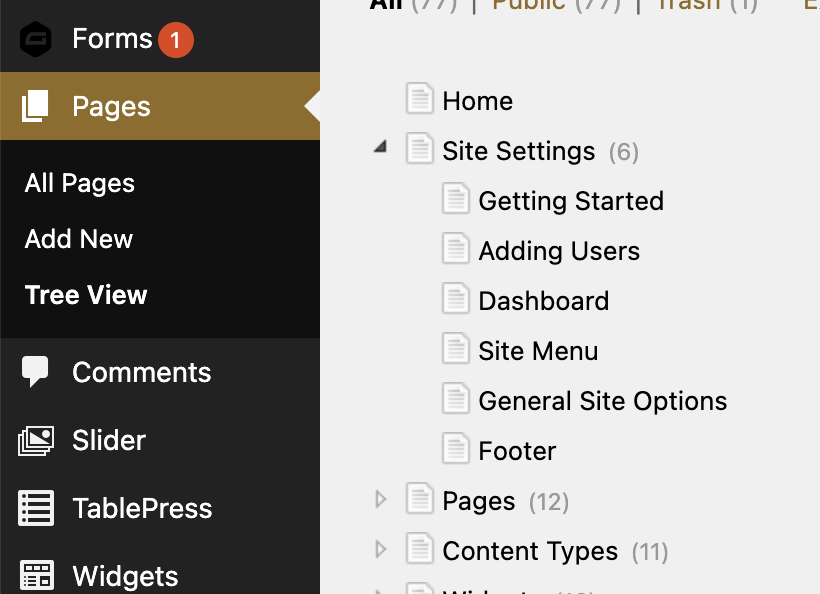
The first step in reviewing your content is to reveal all the pages of your site and be able to add them to a working document. Currently, the best way to do that is to request the Tree View plugin be enabled on your site and then open and paste the output into a Google Sheet. You’ll go to the WordPress backend of your live site and navigate to Pages > Tree View and click ALL of the right-facing arrows to reveal all the pages on your site:

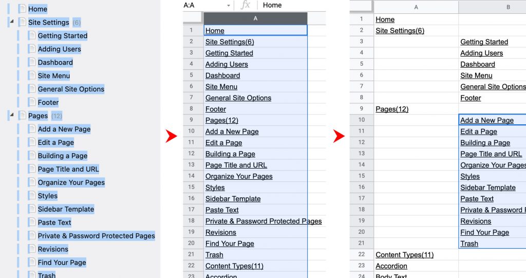
Once you’ve clicked all the arrows and opened all the levels you’ll have a complete list of every page on your site, whether it’s in your navigation or not (Google can still find hidden pages), including drafts. Then, you’ll then need to carefully click and drag your cursor over all the pages and ONLY the pages, then copy them by clicking control C (or command C on Mac). Open a new Google Sheet and highlight the first whole column and paste in your pages. Then, by using the numbers in parenthesis as a reference you’ll want to move over the child pages into new columns to help visualize the structure of your site in review. Repeat moving over columns for as many levels deep as your site goes.

The page links will still work (albeit to the backend of the page) so you can click the page names in your Google Sheet to see and reference the page. You now have an accurate, shareable document to begin the next steps. Add columns as necessary to assign reviewers, mark progress and link to working Google Docs. View every page, click every link, evaluate all content for accuracy, check accessibility compliance and loop in stakeholders and subject matter experts for feedback.
If you find no major issues with your site structure and perhaps only text edits and broken links on your pages, then you’re ready to make those updates.
But if you’re interested in beginning a site overhaul you can use some of the strategies below.
Optimizing your website content
Setting your goals
Reworking your site can seem daunting but identifying the goals of the new site can help keep you focused on what’s important. Whenever you are stuck or entering a new phase of the process, review your goals and make sure the plan hasn’t gone off-track or to make sure you’re not spending your limited energy on the wrong things.
Common website goals:
- Helping website visitors more easily find the resources they need (resulting in fewer phone calls and emails).
- Increasing awareness and enrollment in your program.
- Streamlining a difficult process.
Identify what problem you are trying to solve (or more accurately, what problems are your users trying to solve) with your website and try not to get bogged down in issues that don’t advance that solution.
Evaluating your current site
A great tool to begin evaluating where you stand with your current site is by reviewing your Google Analytics data, this will reveal your most trafficked pages, where your users are coming from and where they’re are getting lost. If you don’t already have access to your site’s Analytics account contact CER and we’ll get you set up. We won’t go in-depth about Analytics here but there is a wealth of information available on the internet for anything you’d like to analyze with this tool.
Depending on your department, you can also talk to any co-workers who might have more direct contact with your users to see if there are patterns with the questions they get asked that could be answered by the website. If you are able to talk directly to your users they may offer some valuable insights as well.
Also, consider reviewing a few websites of your equivalent departments at peer institutions to discover new trends and to view your content structure from a new perspective.
Considering a new site structure
Sticky note exercise

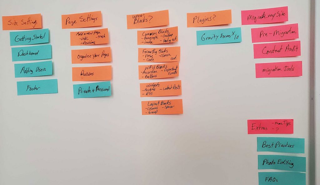
After reviewing your current content and spending some time thinking about what your users need from your site you’ll need to consider how to organize it all. A great exercise is to brainstorm needed pages and write them down on sticky notes, then stick them to a table or wall. This can be done alone or with your team, groups are great because repeated ideas are a good sign you’re headed in the right direction.
Once you feel that you have all the pages captured, then you can begin to try to move them around and organize them logically where they’ll appear in the site’s menu. If you have enough pages to require a drop-down menu, then the goal will be to group them into intuitive “buckets” these pages can drop down from. Try to put yourself in the user’s shoes and consider where they would think to look for this content.
Document this new page structure in a Google Sheet using the columned structure at the top of this page for review and page content creation.
Menu item naming conventions
Another thing to consider, especially in higher-ed, is that these menu items and “buckets” might already have naming conventions that the user is used to. Review a few websites of your equivalent departments at peer institutions to see what the convention could be. Consider a menu item like “Financial Aid”, at different institutions it could be listed under “Cost” or “Affordability” or “Support”. If a potential student has visited several University Admissions websites they’ve already been trained on what it should be called, try not to add yet another clever option.
Creating page content
Writing content
It’s easiest to write the content first, then try to build a page around what you have. Creating one or more Google Docs with the content of your pages is a great way to write, assign or collaborate on your page content creation. If your site is small one document may be enough or you can create a document for each page and link them off of your Google Sheet containing the website structure.
When writing, keep in mind the limited attention span of your average user. Try to be concise and structure the page to facilitate scanning and help them find what they need quickly. Use grouping, subheadings, bulleted lists and accordions to break a long block into several smaller units. Keep in mind that you can also link internally to other pages with more details for those who are looking for them, everything doesn’t have to go on one page.
Have someone proof, review and give final approval of your content (if necessary). Finally, announce a hard stop on Google Doc changes. Updates to the Google Docs after you’ve built the webpage are difficult to track and cause frustration.
Building pages
The best way to get started, especially if you are starting from scratch, is to create blank pages for all your planned pages and build out your site structure and menu on the new pre-production site we’ve set up for you. Then, I recommend building your easiest pages first. You can quickly make a lot of encouraging progress and get practice for your more complex pages.
Depending on your content, the bulk of your pages will be mostly text, maybe a sidebar of relevant resources with a few links, and this is okay. But for higher-level pages, you’ll want to create more interest to highlight valuable information. You can add large images and graphics relevant to your page’s topic, turn your important links into buttons and add feeds from your social media or blog. This theme has a large variety of blocks and the ability to add columns and change row widths for more compelling layouts.
Perhaps your short text list of programs with descriptions:
- Program 1: Lorem ipsum dolor sit amet, consectetur adipiscing elit.
- Program 2: Aenean consectetur congue hendrerit blandit leo.
- Program 3: Pellentesque blandit leo eu urna viverra, id aliquam ante.
Becomes this:

Program 1
Lorem ipsum dolor sit amet, consectetur adipiscing elit.

Program 2
Aenean consectetur congue hendrerit blandit leo.

Program 3
Pellentesque blandit leo eu urna viverra, id aliquam ante.
It’s best practice to keep the most important information nearer to the top of the page, users won’t scroll very far when scanning, so don’t embellish so much that your focus is lost.
It’s helpful to save your homepage for last, you’ve had plenty of practice building pages by then and are in a good groove for content creation. Your homepage should only really set the tone of your department (decorative images, “about us” blurb), highlight top priorities and provide wayfinding to other sections of your site. No need to try to link to everything, that’s what your site’s top menu is for.
Launching your new site
If you’ve restructured your site, then the final task that will need to be completed before launch is creating a redirect strategy. Once your new site is launched the pages on your old site will no longer exist (if your page URLs are different) and will show as broken links from any sites that have linked to you previously. You’ll need to plan where pages from your old site will redirect to on your new site. Provide a spreadsheet of redirects to CER and will implement them for you.
When you feel that you have your content ready for the world to see just contact us and we’ll begin the process of launching your site.
